
York City Kit
1922 - 1969
1922 - 1969
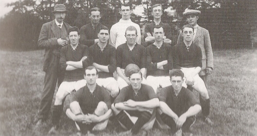
City’s original colours are the subject of much debate. Plain maroon, maroon with white sleeves (and collar) or maroon and white stripes are commonly cited. The maroon / white sleeves are pictured in a match photo taken at Mille Crux during City’s second ever league game against Lincoln City Reserves. However, a team photo, purportedly taken before that game, shows City wearing plain maroon shirts. David Batters noted City’s kit comprised “maroon and white striped shirts and white shorts” (or knickers as they were described at the time) in their first ever league game at Notts County 3 days earlier. That in itself is of interest given County’s historic black / white stripes shirts and black shorts
Note, in October 2020, City themselves stated the colour burgundy was worn between 1922 and 1937, however, looking back at comtemporary reports and programmes, maroon was always the stated colour, never burgundy.
The original socks are believed to be black with a couple of maroon bands. During the 1920s, socks of all maroon and black with white bands were also worn. Due to financial constraints, some City teams of the 1920s appeared wearing socks knitted by supporters’ wives.
Whilst now, maroon can be considered an unusual colour to wear, it was more popular in those days, possibly due to its royal connections.
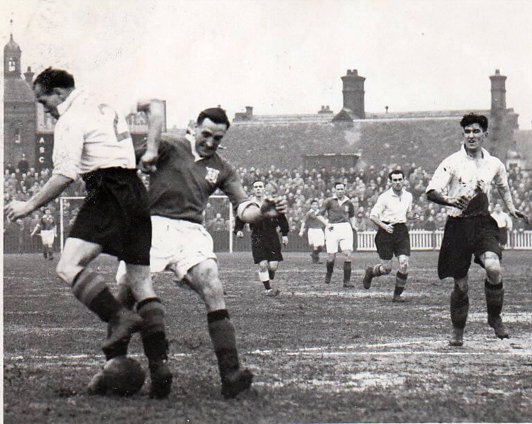
After 2 seasons, City changed to maroon and white striped shirts which were retained until reverting to plain maroon in 1928 and which was used until 1932 (see Walsall photo immediately below).
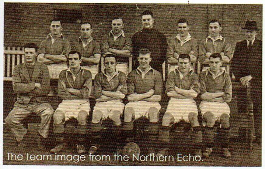
Some reports state the chocolate and cream shirt was introduced for the 1932/3 season, but the Walsall photo suggests otherwise. The works of Paul Bowser might be considered to be the most authorative and he states "I have several cuttings from that (1932/3) season, and City played in plain maroon shirts - see the attached (photo above); the colours changed a year later (1933/4 season), and the programmes from 32/33 do not reference stripes in the team line-ups pages. However, he later stated in the programme (29/08/2022) that City wore dark chocolate with cream trim for the 1932/3 season before moving to chocolate / cream stripes for the 1933/4 season. Chocolate / cream, a nod perhaps to the local confectionery industry with Rowntrees' factory being in sight (and smell depending on the wind) of the new ground. From a grainy black and white newspaper picture, dark chocolate / cream can easily be confused with maroon / white. Black socks completed the outfit. There are also early references to brown shirts and its unclear when brown became chocolate or whether events in Germany prompted the change in description.
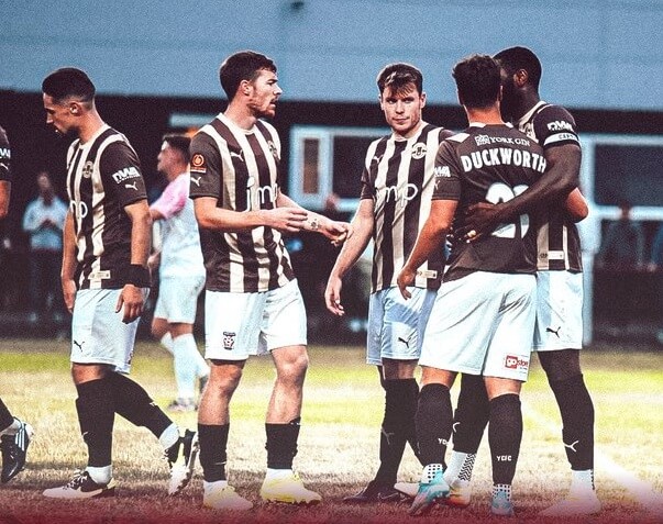
For the 1933/4 season, City played in a unique chocolate and cream striped shirt (white shorts with black socks (brown tops)), again in deference to the city’s confectionery association (although there was no real link between the businesses and the club, apart from the supporters).
Whilst thought to be a unuique colour combination there were reports of Manchester United reserves playing in chocolate and cream hooped shirts against Liverpool at Anfield.
In the early days, clubs chose kits to try to avoid colour clashes, probably one of the reasons for a much wider range of kit colours than nowadays. Although unique, the strip caused a number of colour clashes and requests from the referee for the home team to changes shirts at half time. Gloomy wintry afternoons, no floodlights, possibly heavy / muddy pitches and the washing technology of the time (see below) didn’t help. (Indeed, I recall a rugby league game in the 1980s between Hull and Batley when both teams changed at half time and when the new kit became muddy, Hull as the home side were requested to change again, they claimed they didn’t have a third kit so the referee had no option but to abandon the game, fortuitously preserving their unbeaten record for the season).
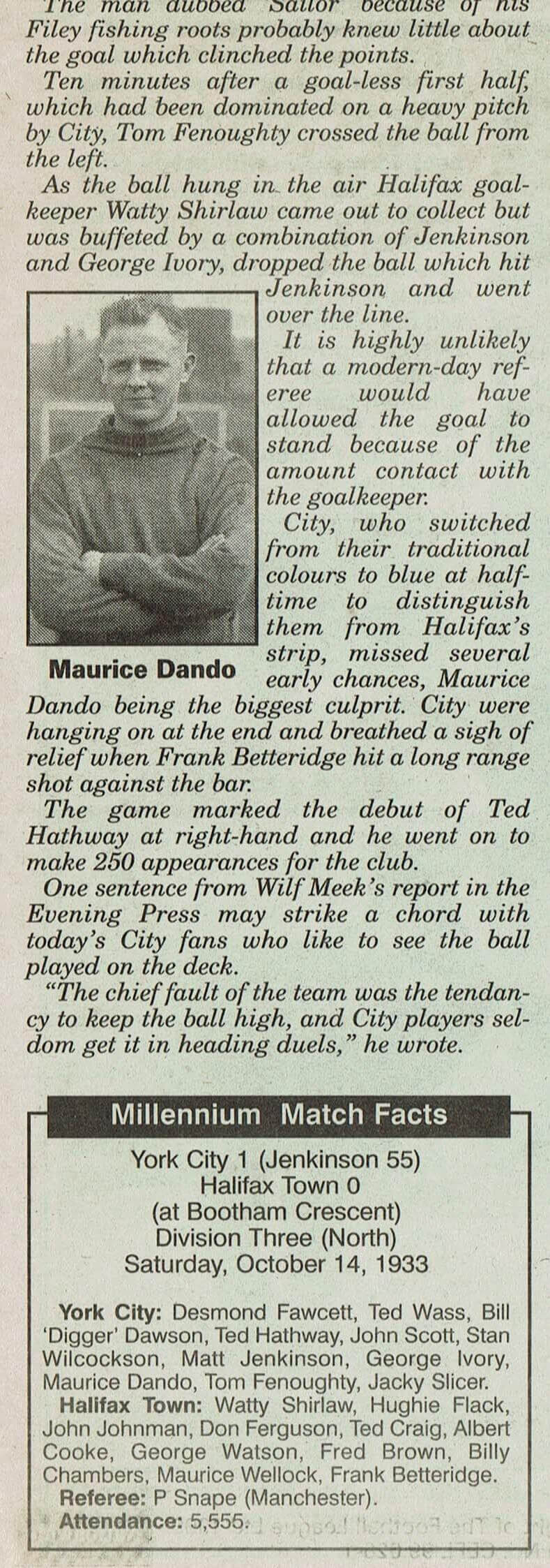
October 14, 1933 was one such occasion when City’s “traditional” chocolate / cream stripes clashed with their visitors, in this case, Halifax’s blue / white stripes in the fading light. With modern day language I would be hard pressed to say “traditional” for a kit worn for only a few months, but could just about accept that the solid blue shirts that City wore in the second half provided a contrast with Halifax’s striped blue / white shirts. City also changed into blue to avoid a clolour clash with Doncaster Rovers (1933) and a game against Rochdale.
Sock design was to change frequently, but always included a combination of red, white and black. Contemporary reports stated the chocolate / cream shirts clashed too often with the opponents' kit.
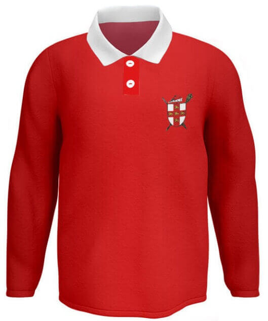
Deemed "too sombre", in 1936, City changed to a “distinctive” red shirt. Red shirt, white shorts was to remain the first choice kit until 1966 and this is where "The Robins" nickname probably originated, the earliest known reference being in the run up to the 1938 FA Cup tie against WBA, known as "The Throstles".
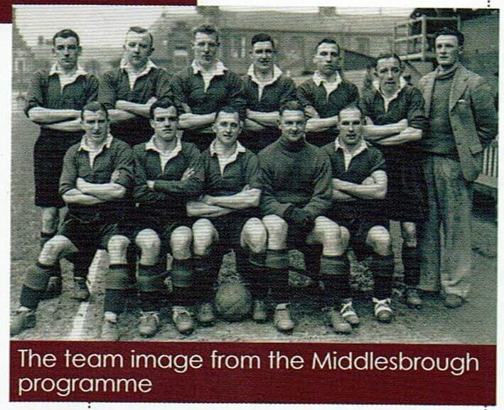
When City played Middlesbrough at Bootham Crescent in the FA Cup in February 1938, to avoid a colour clash, both teams changed colours. City wore tangerines shirts (and black shorts), new kit supplied by Mr Bert Wilkins of Clifton. Boro played in white shirts and dark shorts. FA Cup regulations at the time meant both teams had to change shirts when there was a colour clash. Boro won the toss for first choice change kit.
When City played Scarborough in the 1954/5 FA Cup run, City played in blue and white and Boro in yellow and black. A season later, in the January 1956 game with Sunderland, City wore blue and white whilst the visitors wore white and black.
WW2 presented a kit challenge. Clothing was rationed and City appealed to fans to donate unwanted clothing coupons to put towards new kit.
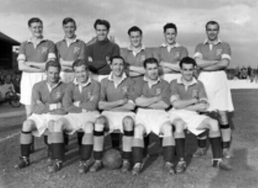
The kit issue persisted into the early 1950s when City teams were pictured wearing mis-matched socks and shirts some with badges, others without.
Traditionally (like every other club), City did not have an official badge and so therefore no shirt badge. However, for 1950/1, by Christmas, City’s shirts included the City Of York crest, presumably, as part of the Festival Of Britain celebrations. It was a relatively short lived addition as the shirt crest / badge, ceasing at the end of the 1952/3 season. The badge didn't regularly appear again until the late 1960s when they became commonplace. Generally, clubs did not sport badges, the only real exception being the FA Cup Final when teams wore their town / city badge (rather than a club badge).
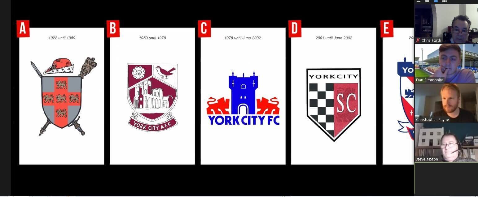
In 1959, City forward Peter Wragg designed an emblem that incorporated a robin, white rose and the minster. The new badge was subsequently worn on club blazers and featured on a wooden shield that was displayed in the windscreen of the team coach for away games. In the days before commercialism, it was not seen on shirts or elsewhere, including the programme, club stationery or ground signage.
1963 saw the programme change the kit description changed from "knickers" to "shorts".
As City’s fortunes floundered, after 30 years, an all white kit (with red piping on cuff and collars) was introduced for the 1967/8 season. The shirt was tweaked in November 1968, during City’s second and final season in the all white kit. Newspaper cuttings from the Darlington game (30th November 1968) show the shirts featured a round emblem and lettering. The same was added to the away strip. The badge was replaced by an embroidered ‘YCFC’, the first shirt embellishment since the City Of York motif in the early 1950s. The white shirt featured red / white trim although the programme cover displayed an image of a player wearing a white shirt with all red trim.
The red shirt, in many different designs (round / V neck / collar / trims had seen City through good (and bad) times and would be back. Across the years, white had been the predominant change strip colour.
1969 - 1990
1969 - 1981
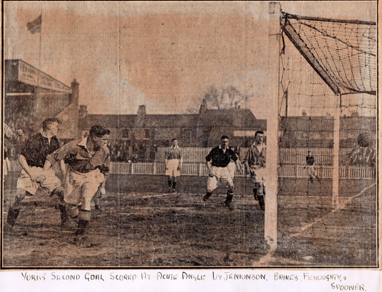
With City’s fortunes continuing to flounder, City reverted to maroon shirts / white shorts in 1969. Some reports at the time blamed the high laundry bills arising from the need to maintain a pristine white coloured shirt was the underlying reason for the switch of kit. Originally deemed as avoiding colour clashes (press reports at the time noted only 4 other clubs played in maroon, all being in the top 2 divisions). Quickly the statement fell by the wayside, including when City played in Middlesbrough in the FA Cup in 1970 in their previous seasons white kit.
For 3 seasons (1969-72), it remained pure maroon, with a round neck and the letters YCFC. For 1972/3, a white winged collar and V shaped insert appeared. Although worn from the start of the season, the first known team photo of it is dated Janaury 1973. That month (at Bournemouth), City introduced number tags on their socks, something Leeds had famously introduced a few months earlier, Don Revie claiming that his obscured view from the dug out meant that they allowed him to more easily identify players. City kept them for the rest of the season. Strangely, on random occasions, City continued to sport the previous season'smaroon shirt.
In 1973, the 1973/4 shirt was embellished with a white stripe running down both sides starting underneath the armpits. It was around this time that the tradition of handing shirts down from first to reserve to youth sides first ceased, although much later, in the NLN days, with shirts no longer bearing players' names, the tradition was revived. Once again, the 1973/4 season saw an instance of old kit being worn, against Wrexham in October 1973, City wore the 71/2 shirt. On the opening day of the season, City wore blue shirts (rather than the regular white change shirt) at the request of their hosts, Charlton who played in red shirts.
The late 60s and early 70s saw City's shirt feature the letters "YCFC" embroidered onto it, but it wasn't until the 1974/5 season that the shirt featured the club badge. Note, the intermediate side wore a shirt with a badge during the 1970/1 season.
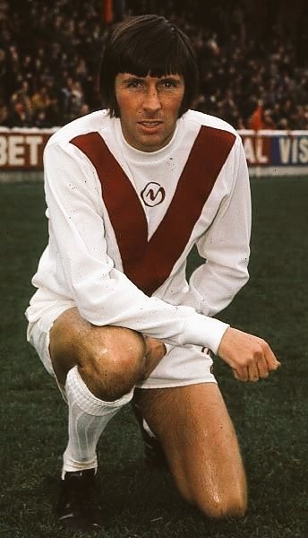
A season later, 1974, as City celebrated promotion to the old, Division 2 (now The Championship), not for the first time (remember chocolate and cream), City’s kit was re-designed to provide a unique design with the “Y” front. City’s “Y” was added to the shirt.
The “Y-front” was designed by Peter Turpin, a former City junior, and was one of the many promotional ideas of Keith Hunt, City’s newly appointed and short lived first Commercial Manager. At the time, there was no advertising value (it was in the days before Yorkie bars) and didn’t incur the wrath of The BBC unlike Coventry’s shirt of a few years later featuring a design which had like the letter “T” incorporated into it, some said denoting Talbot and the city’s car building tradition.
The kit served City for 2 seasons, although several slightly alternate designs were seen and were worn interchangeably. The colours being reversed as a change kit with a plain blue shirt (white shorts / socks) being worn at Highbury in January 1975, presumably maroon clashed with red and white clashed with Arsenal's white sleeves in an era when teams often changed shorts and / or socks to avoid both teams wearing the same colour. 1975/6 saw black shorts on the change kit.
A change in kit supplier from Admiral to Umbro saw a new shirt introduced in November 1975, the small "CY" motif below the collar was removed. From 1976/7, for 5 seasons, Admiral supplied the kit and it included a much larger motif.
After 2 seasons in the second tier, in 1976 relegation was marked with a new kit, the maroon and white on the shirt being reversed.
2 years later, 1978, City were applying for re-election after 2 successive relegation seasons. City went through an entire re-branding exercise and reverted to Admiral manufactured red shirts, this time with navy blue shorts, the first time blue had appeared as part of City’s regular first choice kit. Y fronts being put to bed until 2002. All gold (yellow or amber given your memories) was the usual change kit for 1978/9 before becoming white.
The biggest change during this era was the introduction of shirt sponsorship, first allowed by The Football Association in 1977. Kettering Town were the first club to wear a sponsor’s name on their shirt. In 1979, Newitts were appointed as sponsors of City playing kit.
1981 - 1990
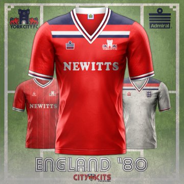
It should be noted that City’s club sponsor was Newitts and the team were pictured wearing shirts with their name on the front in various team photos from 1981. For many years thought to have never been worn in a competitive game. However Paul Bowser noted (26/12/2022 programme) a white shirt with a Newitts sponsorship logo was worn at Aldershot in October 1981. In 1981, City's shirt supplier, Admiral went into receivership. For the 1981/2 season, Le Coq Sportif were the shirt manufacturer, a hastily arranged deal after preferred supplier LCS withdrew at the last minute as they couldn’t supply children shirt sizes. They were followed by Hobott, a little known Sheffield based sportswear manufacturer who supplied shirts for the next 3 seasons, an era which first saw replica shirts sold in the club shop.
In February 1984, City signed their first shirt sponsorship deal. It was with Cameron's Brewery who were to be closely associated with City for several years around the time. Chosen for BBC Match Of The Day coverage in a Division 4 table topping game at Blackpool, the sponsored shirt made its bow, emblazoned with "Hansa", a popular Cameron’s lager, on the light blue change shirt. The logo appeared on the shirts for the rest of that record breaking season. An extended deal with Camerons saw “Camerons” appear on the shirt from the start of the 1984/5 season before changing back to "Hansa" in December 1984. The association ending, at the end of the 1989/90 season, when Cameron's commercial director, Henry Brittain, formerly a long serving and prominent former amateur footballer with Rowntrees' (and City's reserve side) left the company in early 1990.
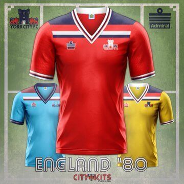
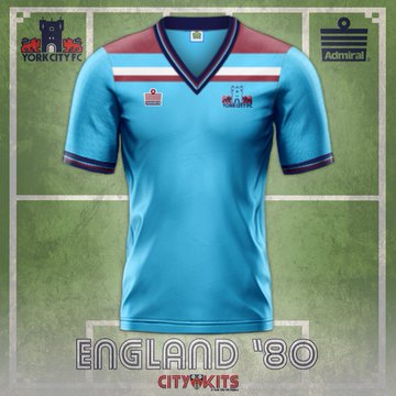
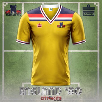
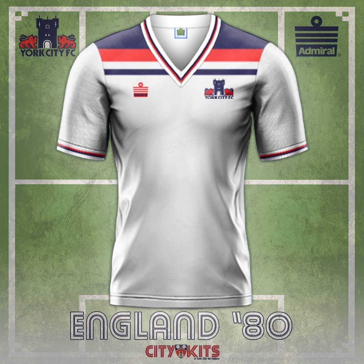
The 1985 "Arsenal" shirt featured white sleeves and a white flash across the upper body.
1990 - 2016
1990 - 2016
Recent years have seen continual changes in kit design as shirts became a fashion item and money maker for clubs. Socks changed frequently and the shirt design changed even more frequently.
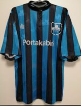
From his time working for City, James Richardson recalls a particular red Portakabin shirt, “I had nightmares about the square dot above the ‘I’. The standard font is square, but Portakabin changed it to a circle. Can’t remember exactly which kit it was, but we had hundreds delivered printed incorrectly and had a sticker placed (ironed on) over to correct it, which is why if you have one, the dot is too big. Anyway, to cut a long story short, the dot should be circular”.
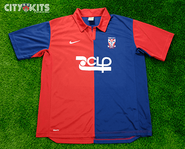
For the 1990/1 season, City's shirt sponsor was Flamingo Land (nearly a decade before their owner launched a hostile takeover bid) and was followed by 10 years with Portakabin (1991 - 2001). The Yorkshire Evening Press (2001-3), Phoenix Software (2003-5) and CLP (2005-6) all followed. Reports suggested that CLP paid £50,000 for the privilege to be H&A shirt sponsor for the 2005/6 season. Legal firm Pryers Solicitors enjoyed a 6 year association (2006-12) as shirt sponsor which ended with 2 wins at Wembley in 2012. 7 years (2012-9) with Benenden Health followed before Jason McGill’s JMP assumed shirt sponsorship in 2019, a deal that was to last 4 seasons (2019-23) and straddle the end of Bootham Crescent / start of the LNER years, meaning images from those shirts will live on in the memory and media. It is believed that the value of many of these shirt sponsorships annually amounted to around a small five figure sum.
August 2023 saw the beginning of the Uggla years and "Titan" shirt sponsorship deal, a wealth management company believed to be known to the family.
The 1993 shirt saw a "YCFC" logo introduced on one shoulder and the opposite short leg. It made its debut in the home leg of the 1992/3 play off against Bury. The red / blue combination remained intact until 1997. In that year, City played in all red, albeit with blue and white pipping running down the shorts and shorts.
1993 and Wembley saw the club shop take £15,000 in sales in a week, mainly shirt sales.
In 1995, Admiral become city’s kit manufacturer. The deal was extended into a 6th season on 25th February 2000. For the 1996/7 season, the red / blue colours were retained. The new 2nd kit was all white with blue socks (the previous blue / white clashed too often) and a 3rd kit was introduced, turquoise (or plain blue depending on your vision) / black stripes, black shorts and blue / black socks (a la Inter Milan), with a "grandad" style button down collar, the first stripes since the chocolate / cream of the 30s. It lasted into a second season but was never popular with referees, especially under floodlights. The millennium ended with a Hibs style green shirt / white sleeves changed for 2 seasons between 1998 and 2000. The era generally saw sales of around 1,000 home replica shirts per season, however the 1997/8 red "tramline" design, navy blue and thin white stripes running down the shirt sold 800 in the first 4 weeks it was on sale in summer 1997, including £6,000 of sales on day one. This Sheila Smith / James Richardson era saw some of City's most innovative shirt designs ever in an era when shirts generally lasted 2 seasons.
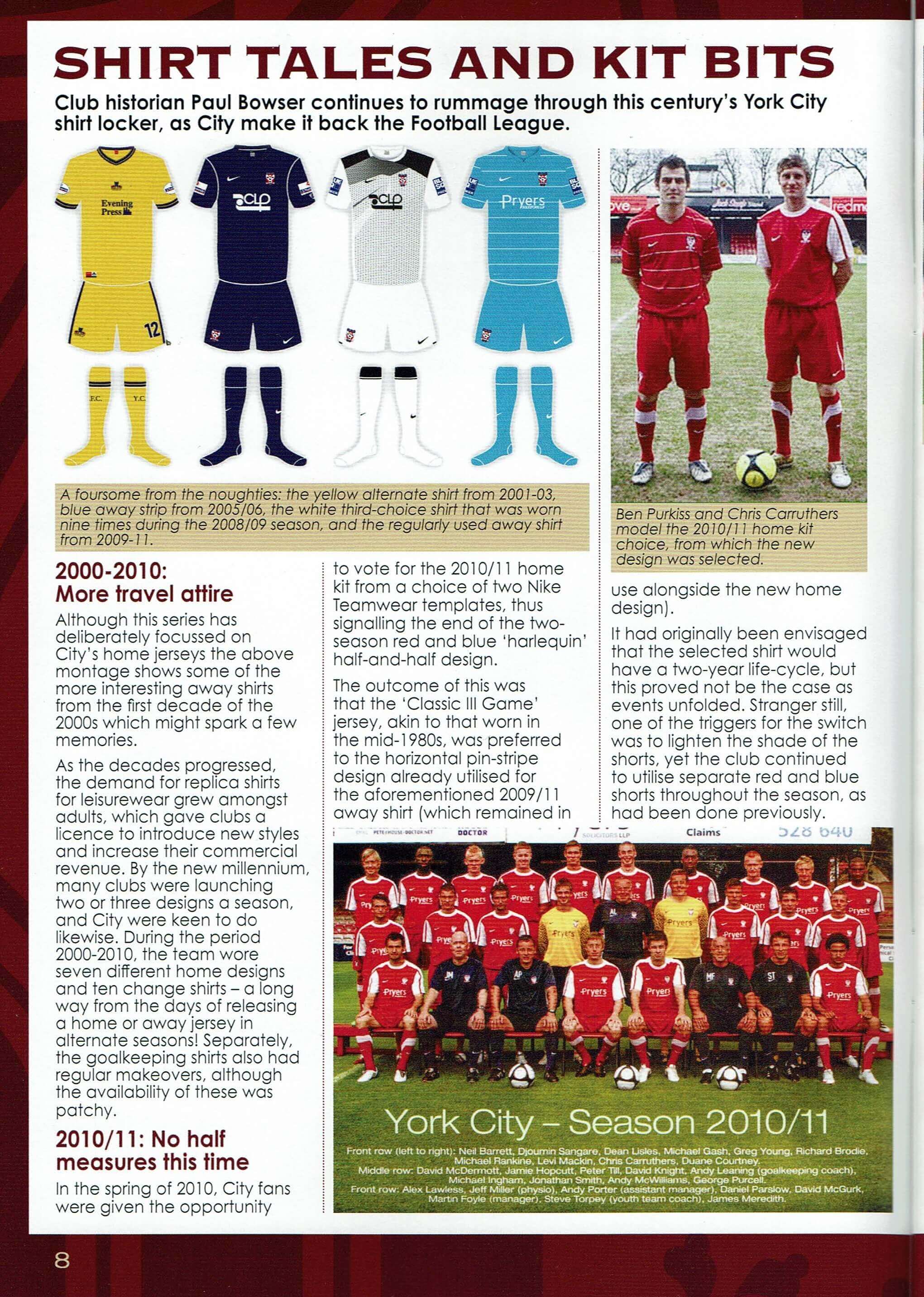
As the trend for replica shirts grew, between 2000 and 2010, City wore 7 different home shirt and 10 different away designs.
For 2001/2 and the following season, City organised the manufacture and supply of their own shirts under the "York Lesisure" brand name in a bid to alleviate supply issues experienced under the Admiral deal although the era was deemed a step backwards in terms of style and comfort.
The John Batchelor era saw City revert to a "Y" front, this time in red (white "Y" and red shorts) as he sought to bond with City’s supporters. To link the club to Batchelor's motor racing ambitions, the shirt had one sleeve with a black and white chequered flag design at the shoulder.
The end of the Batchelor era saw a 3rd badge in 5 years. In 2003, under a Nike deal, the York City Supporters Trust introduced a "5 Lions" design, featuring the lions from the city's coat of arms and a big "Y" as a result of a Yorkshire Evening Press competition. This replaced Batchelor's garish "chequered flag" design, part of his unpopular "York City Soccer Club" re-branding. This itself had replaced the "2 Lions" crest (the lion's being either side of one of the city's bars). The 2003/4 season saw City switched to Nike supplied kit.
2004 saw City leave The Football League and direcetor Terry Doyle labelled City "the Arsenal of the Conference", a reference to City's new Arsenal style shirt (and who knows if he meant more than just the shirt colours) For 2005/6, the shirt featured "Casino Times", City's first ever rear of shirt sponsor. The 2006-8 period saw light blue / maroon and yellow / green changes strips whilst front of shirt discreetly displayed the wearer's squad number.
2008 saw a radical departure when the shirt featured red / "midnight navy blue" halves. In November 2009, red shorts replaced the navy blue ones as Conference rules advised that dark ones should be avoided and comments from City players that the dark shorts sometimes made it difficult to pick out teammates, especially under lights.
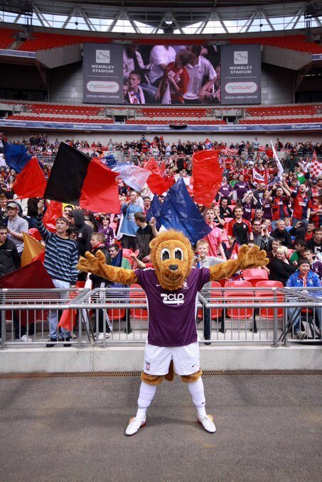
In 2009, City wore a one off purple shirt for the FA Trophy at Wembley. Purple being the colour of the robes of the Archbishop Of York, the shirts were auctioned after the game with proceeds going to his youth charity. "Pryors Solicitors" appeared (back of shirt) for the first time as a shirt sponsor and were to occupy the front of shirt position for the next 3 seasons. For Wembley 2010, City stuck with their normal red / navy blue shirt although embroidered commemorative working was added.
Designs had been plucked direct from the Nike Teamwear catalogue for a number of years. In early 2010, City fans were asked to choose the 2010/1 shirt, an Arsenal style red / white shirt beating a red with a white horizontal pin stripe. It lasted one season, before the 2011/2 "Wembley double season" red with white chevron design displaced it. For both 2012 Wembley appearances, City's shirts featured embroidered match details.
In 2012, a new red / white shirt (blue shorts) was launched featuring the Benenden Healthcare logo, they had replaced Pryors Solicitors in the summer as main sponsor. Uniquely, in January 2013, they rebranded and City updated their logo on the shirt. Benenden funded an old for new shirt swap.
2013/4 saw no new shirts launched. That hasn't happened since.
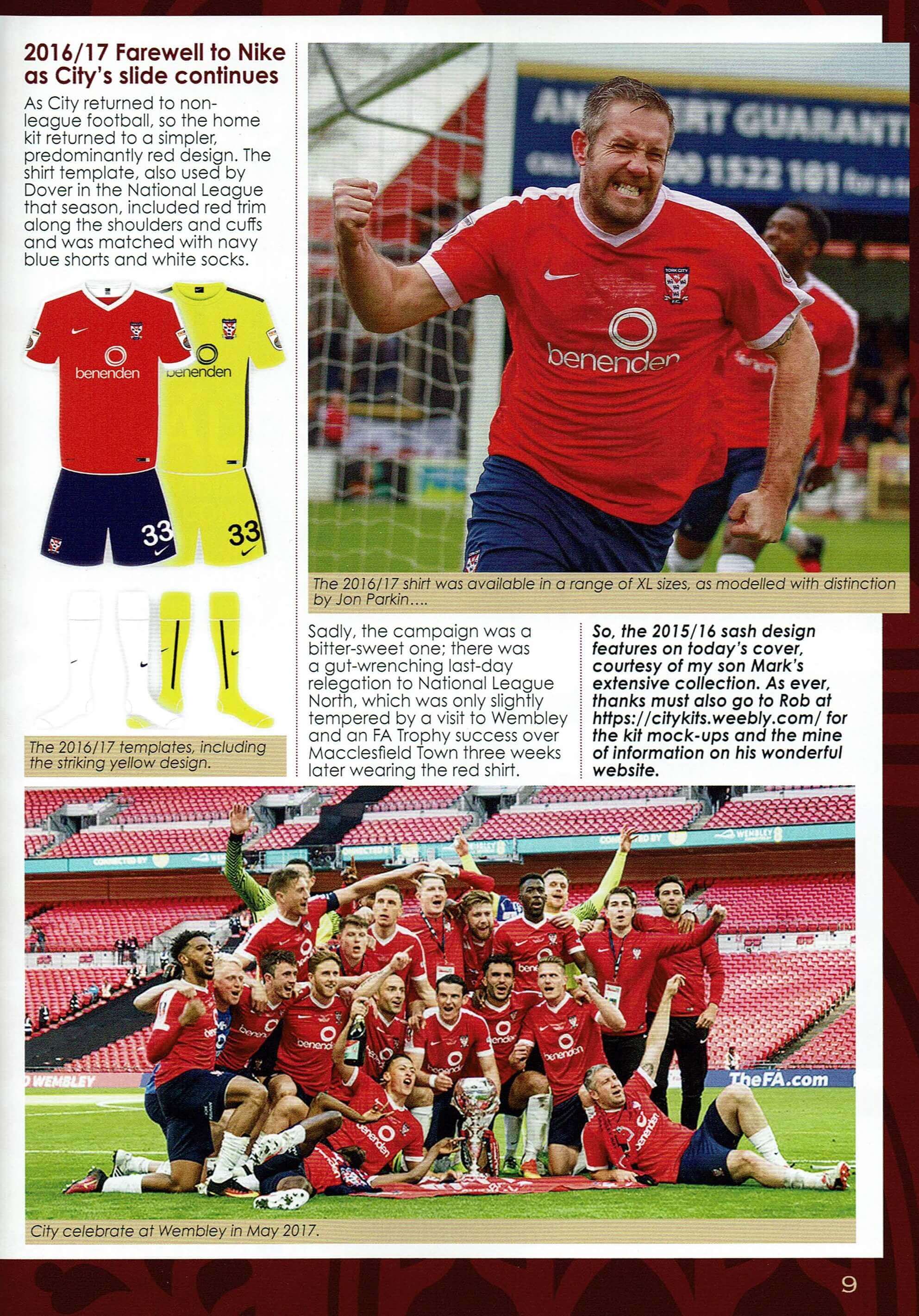
For 2015/6, City introduced a new design, a red shirt with navy blue sash from right shoulder and fading in colur towards the left waist. An all black (with thin luminous yellow stripe ("volt") down shirt, shorts and socks) was introduced, the first time City had worn black. The "volt", as in electric current volt, has also been described as "electric green". That kit was sometimes, reversed to yellow / black volt and made its debut in Richard Cresswell's only game in charge and was worn on City's last league appearance at Morecambe. It became the de facto change kit for the following season and was rather unkindly described as "hi-vis" yellow. Given the designs were taken from a catalogue, teams like Hartlepool, Orient and Charlton wore the same designs in different colours.

2016 - To Date
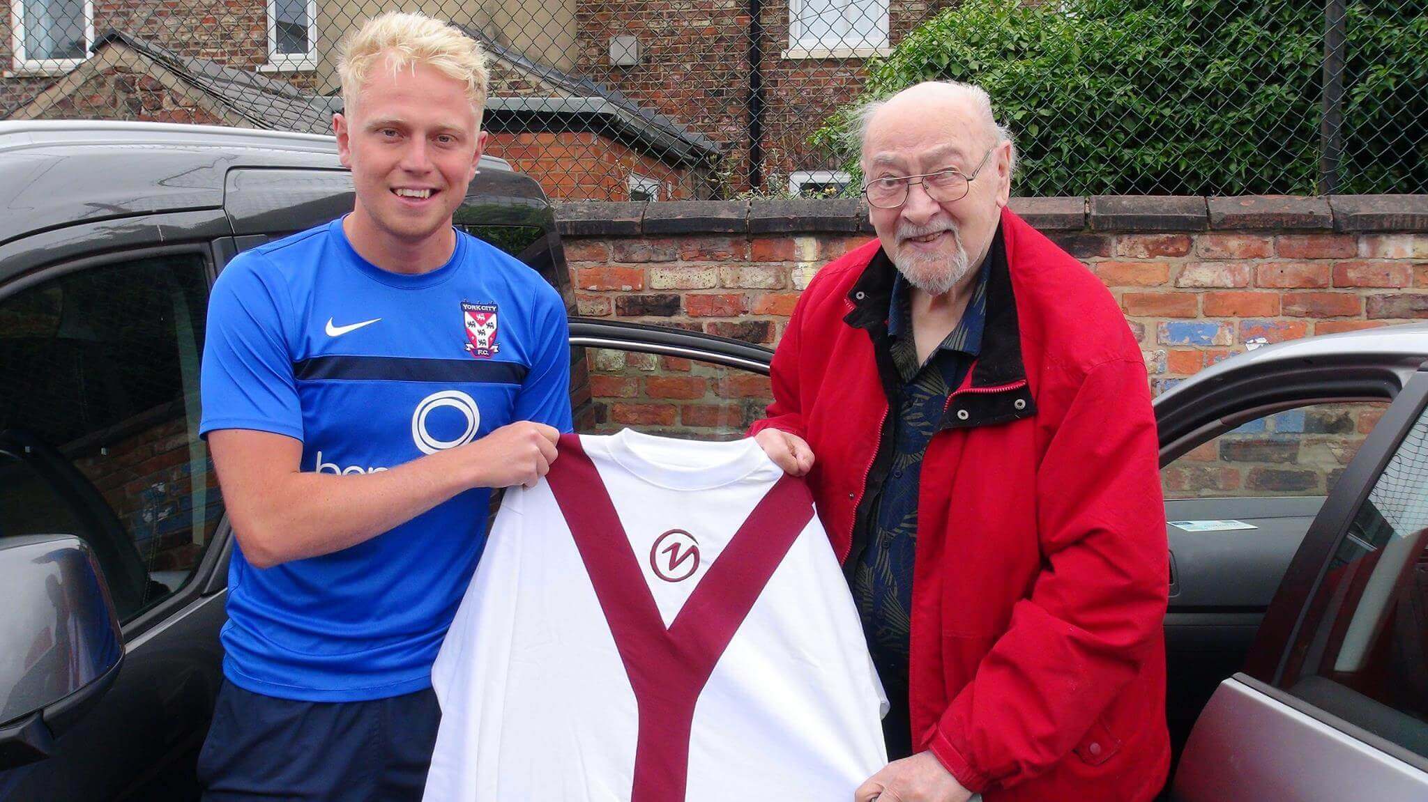
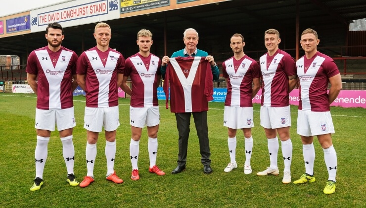
For the 2017/8 season, after 14 years, Avec replaced Nike as kit manufacturer. The deal lasted one season before City awarded Dreamsport a 3 year contract to wear the Under Armour brand. Initially, shirts were generally of a classic colour and design until in early 2019 when City announced a hugely popular one off maroon Y-fronted shirt (see above) for the planned last ever game at Bootham Crescent, due to be played in April 2019. Stocks sold out within 3 hours. Another nod to tradition saw the York coat of arms appear on the shirt for the first time since 1952.
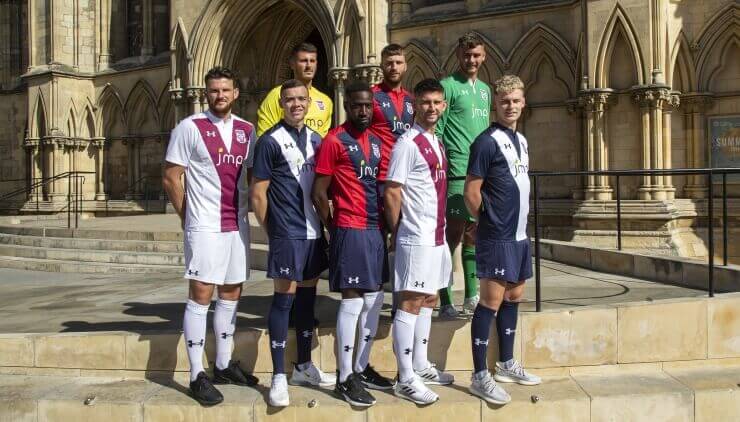
Given the stadium move being delayed, the shirt was not worn as intended. However given its huge popularity, City kept the design for the 2019/20 season (see above), this time, red with a navy blue “Y”, the change kit being the colours reversed (albeit a white “Y”), another nod back to the 1970s change kit and a white shirt with "Y" as third choice.
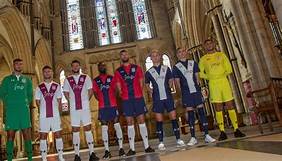
In a break with tradition, the 2019/20 kit was launched in an event staged at York Minister. For the end of season play offs, City were granted permission to wear the commenorative maroon Y shirt (white shorts and socks) in what was expected to be the last ever game at Bootham Crescent. Manufactured in 2019, it contained the sponsor's name "Benenden Health", they'd ended their sponsorship deal in summer 2019. City legend Graeme Crawford, spoke when the shirt was unveiled in early 2019, “Everyone used to like wearing this shirt and I think the design is now synonymous with York City Football Club. It was also a lucky shirt back in the seventies and, hopefully, it will be as lucky again. The new version puts a modern take on an old design and I really like it." Unfortunately, it wasn't lucky this time.
2020/1
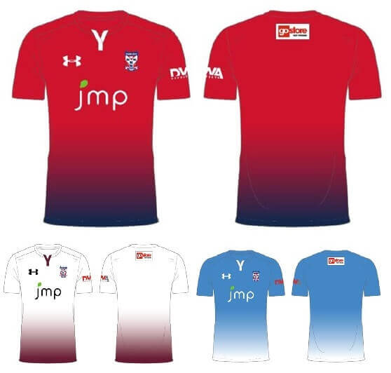
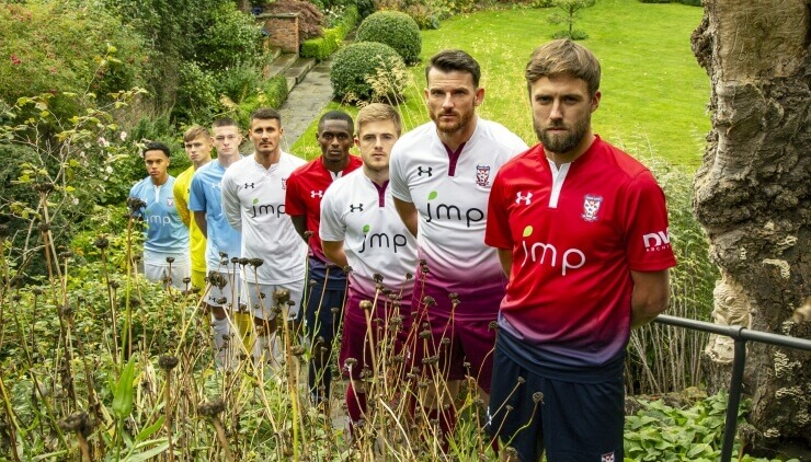
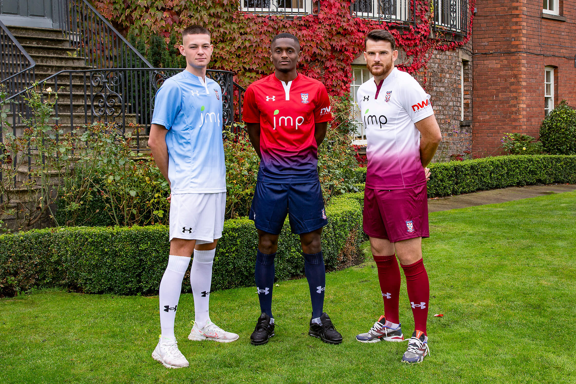
For the 2020/1 season, the home kit featured a red to navy gradient shirt, navy shorts and navy socks. The neck incorporated a "Y" design into the collar, a twist on City's iconic Y-front design.
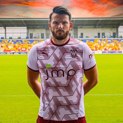
The away kit was produced with a nod to the club’s heritage using traditional colours white and burgundy (First time I’ve seen it described as burgundy and not maroon – Ed), which were used from 1922-1937 and in the 1970s. The 3rd kit design will feature a sky blue to white design with white shorts and white socks.
Goalkeeper kits were green, yellow, and white designs respectively.
For the first time, the kit featured 3 sponsors’ names, main sponsor JM Packaging, back of shirt sponsor GoStore and new sleeve sponsor DWA Architects.
Details were announced on October 1st but given logistical difficulties, City kicked off the season in the previous season’s kit. The new kit made its bow in game 5 (October 17th v Brackley). However, that season's home kit was worn for the last ever game at Bootham Crescent and first ever LNER game.
2021/2
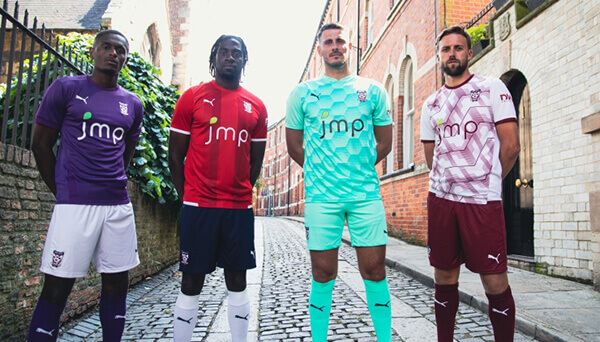
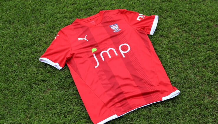
On 18th May 2021, City announced Puma as the club’s new official kit provider on a three year deal starting on 1stJune following the end of the Under Armour contract. It will expire at the end of the 2023/4 season. For the 2021/2 season, JM Packaging will sponsor the front of shirt whilst York Gin will adorn the back of shirts, DWA Architects as sleeve sponsor and Go Store Self Storage as back of short sponsor. Sporting Director Dave Penney said, “We are delighted to secure sportswear giants Puma as our official kit provider for the next few years. The new kit designs have been finalised and we anticipate delivery before the start of pre-season for our full launch.” Martin Ivison, from Puma UK, commented, “Everyone at Puma is really excited and looking forward to starting our new partnership with York City FC, and it will be great to see the team run out on the pitch in Puma next season. York City is a Club which is clearly ambitious, and we’d like to think we are the lucky charm as proven with other Clubs who have been on the same journey to the EFL. We look forward to a long a successful partnership.” The designs mirrored recent years with one "off the peg" design and 2 "own design" shirts.
The Puma era has seen a number of stylised shirts which have drawn much acclaim and big sales.
2022/3
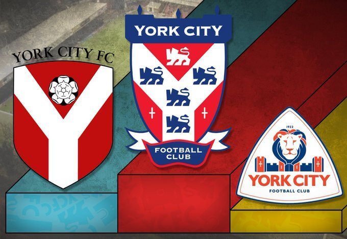
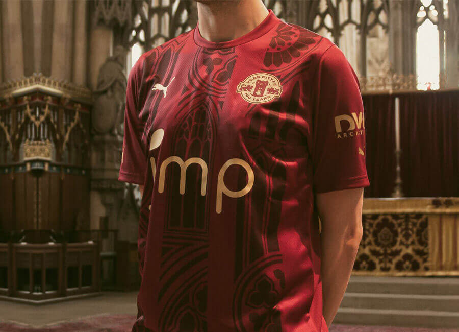
On May 6th 2022, as City celebrated their 100th birthday, first details of the 2022/3 home shirt and centenary badge were announced. In City's own words, "York City Football Club is delighted to reveal their new Centenary badge and bespoke Puma kit for 2022/23. The York Minster inspired home shirt was unveiled at the iconic cathedral this afternoon on the club's 100th birthday. The strip reverts back to the traditional colours of maroon, with gold centenary accents to create a truly God like feel and design. The limited edition kit is available for pre-order now exclusively from the online store, with delivery available worldwide". See the Centenary logo reveal.
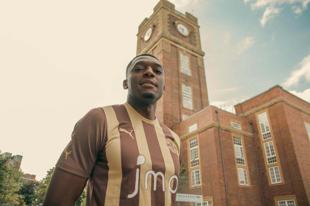
Again, with a nod to City's history, on June 15, a chocolate and cream change kit was announced.
2023/4
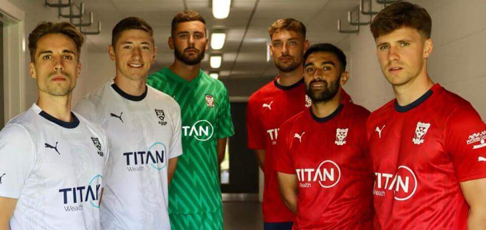
The new season's kit was announced on July 8th with the lateness attributed to a delay in confirming the main shirt sponsor. Back in November 2022, Glen Henderson had alluded to a deal being in place (believed with a world renowned brand about to expand into the York city centre), it fell through as did speculation of a later deal with Portakabin. The main shirt sponsor was Titan Wealth, an international financial services group providing client to custody solutions through acquisition, development of technology and ownership of investment funds, they are uniquely positioned to offer a complete suite of product and services all the way from advice to investments, execution, custody and settlement. Easy Telecommunications become back of shirt sponsor and The Potions Cauldron (based in The Shambles, makers of magical drinks and creators of magical experiences) became the new shirt sleeve sponsor. City reverted to red shirts (dark blue shorts and white socks) with a faded 'Y' pattern throughout the shirt. In September 2023, Dutch Barn Vodka replaced Easy Communications as back of short sposnsor, it is believed the original sponsor was in breach of contract. City offered to replace fan's original shirts with a new shirt showing the new sponsor free of charge whilst the team (new signings excepted) continued to wear their original shirts but with a patch containing the new sponsor's name stuck over the top of the original sponsor. The change kit was white shirts with navy shorts and socks. Read More.
There was some chatter around the qualty of the badge on the shirt. Weebly (a now defunct City kit website)'s initial response was "In recent seasons there’s been a (not very) fascinating move away from embroidered badges. For context, elite / player spec kits for big teams nowadays have lovely, precise and detailed rubber badges. I’d love to see a City kit with one of those but that is more a Champions League level thing. Last (2022/3) year’s was printed plastic (?) in the way that you would expect a sponsor to be applied. I believe, the NLN promotion season kit (and the red/navy fade kit) had a cheap and poorly printed heat applied badge. The fade kit also had sublimated badges (incorporated into the fabric - nasty). Both the navy Y-front and preceding white collared Under Armour kits had a lovely badges that were their own entities but attached onto the shirt. These also had a white surround. The Y-front also had a shitter, sublimated version. The last time we had an embroidered badge was the red / navy Avec kit from 2017/18 (first NLN season).
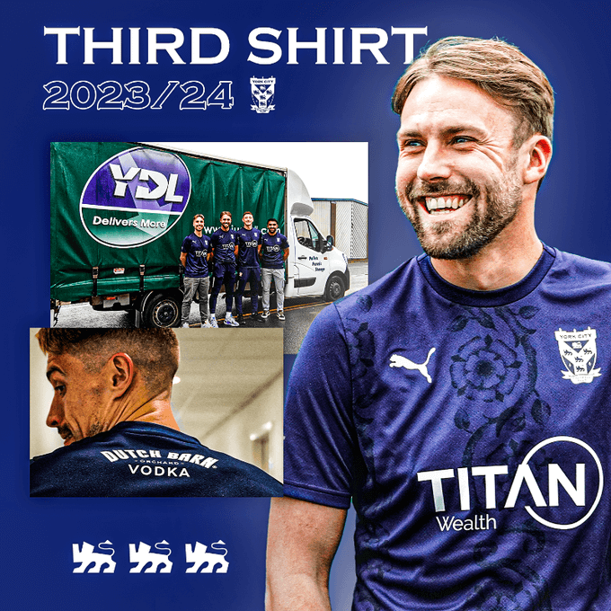
On October 26, a 3rd navy blue kit was announced sharing the same design as this season's white away kit and incorporating "a distinctive rose design in custom produced fabric with a new modernised look, the shirt gives a nod to Yorkshire whilst giving a modern look and feel". First notification of it came after its inclusion in the latest edition of Football Manager. On November 4, in the FA Cup tie at Chester, City donned black armbands with the Poppy on, the first time City had acknowledged Remembrance Day on their shirts.
In April 2024, City launched a retro range to celebrate 1974 (promotion to Division 2) and 1984 (101 points and Division 4 champions).
2024/5
For the 2024/5 season, City switched kit suppliers to Hummel, after plans to go with Le Coq Sportif fell through as they don't made kits for under 7s. Supplies of children's size shirts were in very limited supply even as late as November in the run up to Christmas. The new 3 year partnership will see Hummel provide all on field playing kit and training gear for every YCFC City. The 2024/5 first choice red shirt, revealed on June 11 with new signing Alex Hunt features a distinctive white pinstripe design and boasts the iconic Hummel chevrons along the shoulder. "This is Yorkshire", proudly worn on the back, with the white rose of York on the front and topped with a proper, embroidered badge. Hummel’s ECO8 implementation means each shirt is manufactured from high performing polyester produced from up to eight recycled plastic bottles. Read more. That said, it does look like an off the shelf kit rather than a bespoke design for City. On July 5, Get Branded Workwear, a part of the York based Ceejays group, were announced as sleeve sponsor. Later in July, City announced a third kit, a deep pink (also known as “cotton candy”) and then a “Yorkshire Rose” ("This is Yorkshire" and the white rose of York on the front) inspired away kit in off white (or “coconut milk”), in real life, it looks suspiciously white. All 3 were launched with navy blue shorts. The
launch of the third kit was teased with references Ricky Gervais, part owner of Ellers Farm Distillery whose brand Dutch Barn Orchard Vodka is City's back of shirt sponsor. On August 8, 3active were announced as new back of shorts sponsor. "amc" were shirt sponsors for the academy team's shirts.
As part of the Remembrance Day fixture (Hartlepool (h), 09/Nov/2024), City wore a one off all red strip with players donning black poppy armbands.
Come January 2025, there were reports of Le Coq Sportif facing bankruptcy.
2025/6
For the 2025/6 season, on June 18, Erreà were announced as the new official Benchwear Partner for the National League having signed a multi year, they will benchwear and training kit to all 72 clubs.
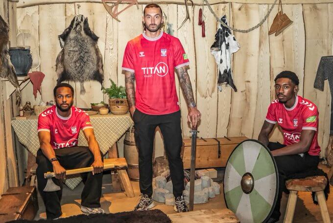
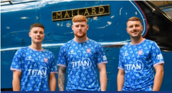
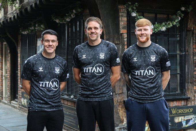
On June 26, the new season's home kit was launched to a rather muted response. Watch the Jorvik Viking Centre reveal, the red shirt comes with white chevrons across the shoulders with white, red and blue trim replete with a Viking boat icon beneath the collar, spelling out ‘YORK’ in runes and a white rose symbol. Modelled by Cam John, MFW and Ollie Banks. The blue away kit (with light blue shorts), "inspired by a city of momentum, worn by those who move it forward. This is York in motion." was revealed on July 3 at the National Railway Museum. A black third kit was revealed for the first time as the players walked out wearing it for the friendly at home to Sheffield United on July 15. The official photoshoot for it was held along the cobbled streets of the Shambles and Whip-Ma-Whop-Ma-Gate, known for its short length and unusual name. City said "Finished in deep black, the shirt features a layered tonal pattern, incorporating elements unique to the club, ‘York’ and ‘City’ are spelt vertically in runes, the ‘Y’ shape and lions from our club crest and the triangle design, also seen on our 2025/6 away shirt. It’s kept sharp by a clean and simple black collar, while our consistent features of a Yorkshire rose on the front and the longship icon on the back are present".
Within weeks, there were reports concerning the poor quality of the repica shirts.
Finally
Best Ever City Kit
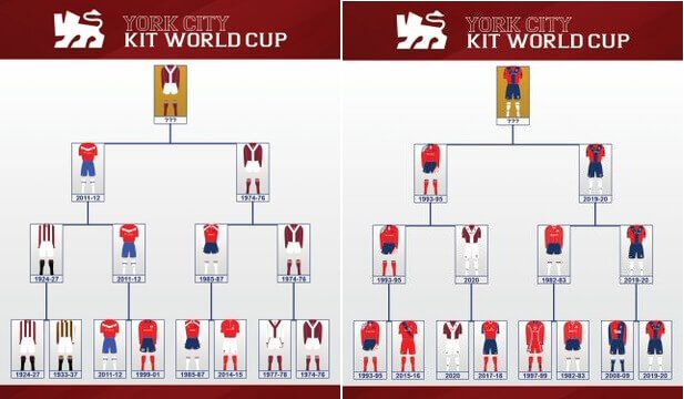
During the 2020 lockdown, City's twitter account ran a series of polls to determine City's best ever kit, the 74-76 kit came out the winner.
For The Record:
Buy current City Kit, all sales benefit York City and retro City Kits.
Read MUCH more: York City kit history.
... and more: The Beautiful History - York City.
This page used to be a link to an external site and is now expanded to give more context.
Plus: a top European shirt site.
Footnotes:
